Victor Engel's
No Dither Netscape Colors
Example Images
This document will show example images that have been optimized using the
6x6x6 palette.

This is an image of the standard Windows colors. No special processing has been
performed on this image.
This is the same image after applying the Netscape palette setting each color
to the nearest color in the Netscape color cube.

If you have a good monitor, and your browser will display all the colors
presented in this document, you may notice a slight color shift between
this image and the previous one. However, the shift is slight. If you are
using an 8 bit system running Netscape, you will notice that the dithers
disappeared in the second image.
This is the same image after using Paint Shop Pro to apply the Netscape
palette using error diffusion.

All the colors in this image are Netscape colors, but there is a
dither still visible because the colors were dithered in the process of
applying the palette. If you look very closely, you will see that the dither
patterns are slightly different from the dither pattern created by your
browser when displaying the first image (assuming you are viewing this
page on an 8 bit system). This is because the dither pattern in the
file is being used as saved. If you are clever, you can take advantage of
this by placing individual pixels strategically. This would most likely be
valuable when designing icons.
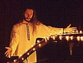
Now let's try the same techniques on a photographic image. This is a picture
of me next to
my car.
This is the raw picture saved in jpg format:

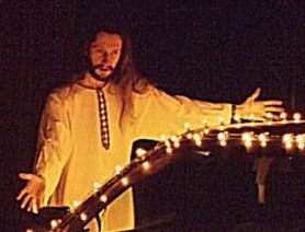
This is the same image after applying the Netscape palette using error
diffusion.
 All the colors in this image are Netscape colors, but there is a
dither still visible because the colors were dithered in the process of
applying the palette. If you are using a 256 color display, this image
probably is very similar to the previous one because your browser has
to dither the first image. If you have a true color
display, the previous one looks much better than this one.
All the colors in this image are Netscape colors, but there is a
dither still visible because the colors were dithered in the process of
applying the palette. If you are using a 256 color display, this image
probably is very similar to the previous one because your browser has
to dither the first image. If you have a true color
display, the previous one looks much better than this one.
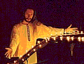
This is the same image after reducing the color depth to 256 colors using an
adaptive (optimized) palette.
If Netscape's palette changed on the fly, this image
would look the best on a 256 color display. With Netscape 2.0 or later, you
can right click on the image and select View to view the image using its
own palette. You may have to click Reload if the image is simply loaded
from your cache. If you have a 256 color display, you will notice a marked
improvement when viewing the image this way. This is not possible with the
JPEG image, above.
This is the same image after applying the Netscape palette setting each
color to the nearest color in the Netscape color cube.
Distracting banding occurs in the image.
In summary, using the 6x6x6 color palette to optimize images for display on
the Web is useful for image containing a limited number of colors or
images captured from Windows programs, for example. However, this technique
does not benefit the display of photographic images. Photographic images
should be presented as JPEG or GIF with an adaptive palette in most cases.
I hope this page has been a help to you. If you find it helpful, please tell
others about it. If you have any questions, comments, or suggestions,
email the author, Victor Engel
at victor@victorengel.com.
Go back to No Dither Netscape Colors Page.
Go back to Victor's Home Page.
http://www.onr.com/user/lights/netex.html
This Page Copyright © 1996 Victor S. Engel
This page and any of its contents may be reproduced only under
specific conditions.